
On The Point – Lake Rotorua
This property is a very special place by lake Rotorua and offers luxury accommodation by the waterfront. This property was originally part of a franchise. When the project started our brief was to create a brand new identity for the lodge – in order to step away from the franchise and create their own independent brand. I worked very closely with the client, observed every facet of the product and we came up with a distinct identity to capture the soul of this property and what it offers to their guests.
Skills:
Branding, Website, UI, UX, Print
Agency:
Tomahawk

The logo is a combination of the circular motif and the beautiful typography. The circular motif was hand drawn to reflect the location, its premium offering and most importantly, the island (Mokoia Island) that can be seen across the lake from the property.
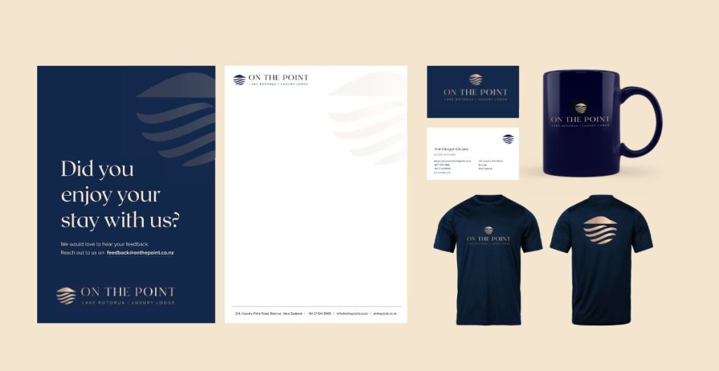
The primary colour scheme of the brand – A deep blue with rose gold – was a very conscious choice to reflect the soul of this brand. It captures the luxury, history and sophistication of the product immaculately.

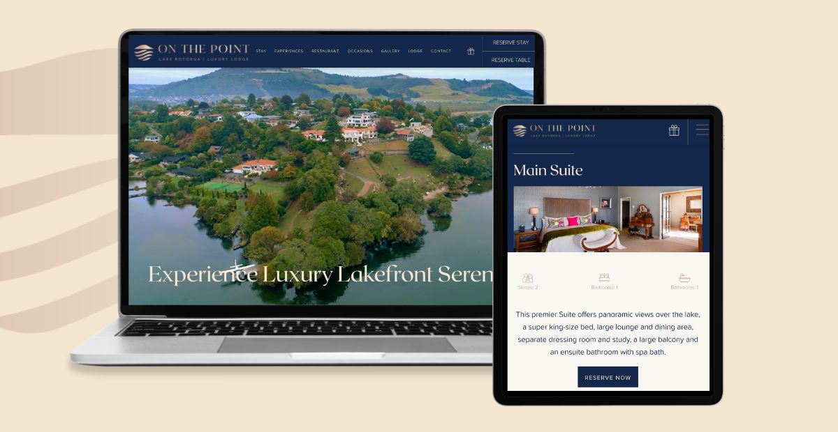
I designed a wide range of print and digital collateral for the brand including but not limited to the brochures, t-shirts, pens, business cards, feedback forms, website, social ads and other marketing assets.


